Just last year I went through a whole rebrand. It cost me a lot of time and money BUT it was one of my 2015 highlights because I finally had branding that reflected who I am, and the colours that represent me as a person.
Choosing the colour of your logo is extremely important. I would never choose Pink or Purple for my branding because both of those colours do not represent who I am. Each colour has its own meaning, along with Black and Red, which are my brand colours.
I choose Black and Red for many reasons. Growing up, I was a hip hop dancer and loved listening to the music I used to dance to. The hip hop group; Run DMC played a huge part in my early years. I felt that their logo represented who they were as a group and it also represented who I was. I am a businessman with authority online, but I am also fun and energetic which is why I decided to follow Run DMC’s lead and go with the Red, Black and White.
Colour isn’t just the only important part of your branding. You also need to consider the font you are using, the spacing between the letters and the overall shape of your logo.
I came across a great infographic created by Canadian card maker; Colourfast which shares some insight into branding and choosing the right colour for your logo. Here’s why the colour of your logo is important.
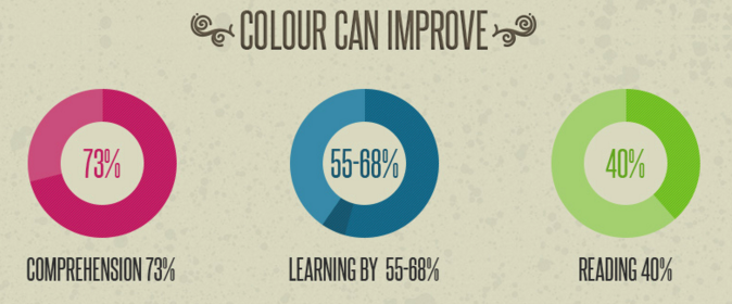
How Influential is Colour?
It turns out, colour is extremely influential when it comes to branding. 93% of purchases are made based on what a customer sees visually, and just under 85% of consumers make a buying decision based on colour.
Colour has been known to increase comprehension by 73%, learning by 55-68% and reading by 40%.
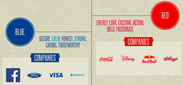
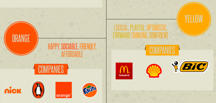
Choosing a Colour for Your Brand
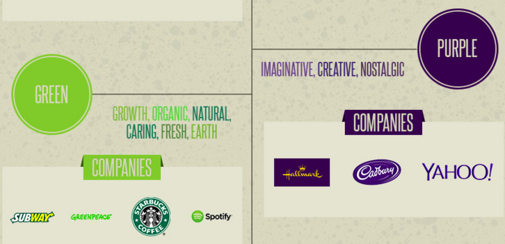
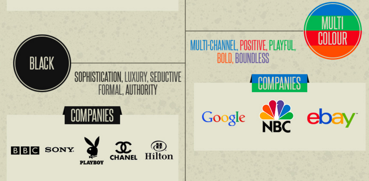
Have you always wondered what the colour Blue means for your logo? Take a look below at what Red, Blue, Yellow, Orange, Green, Purple, Black and Multi-Colour mean for your business logo.
Choosing the Right Font
Choosing the right font is a very important part of designing your logo. If you take a look at HSBC’s logo, they use a classic serif in capital letters which gives off an air of authority, trust and strength. GAP’s logo has wide spacing between the letters to give impact and they have used a square which shows strength, along with white and blue.
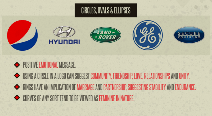
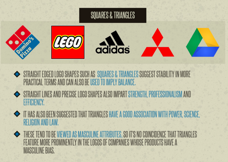
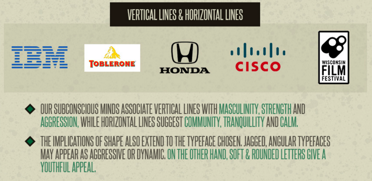
Logo Shapes
Whether you have a square logo, or a circle logo, it means something. Take a look at the below images to get a better understanding of what this means.
I hope this gives you a better understanding around the colours of your logo, the shape of your logo and your font. You can see the full infographic here.
What does your logo say about your business?
Ready to produce game-changing digital results in your business?
Subscribe to receive cutting edge insights on digital leadership and transformation- straight to your inbox
We do not sell or share your information with anyone.